
How do you judge a magazine? Do you flip through all the magazines to decide the One? Or do you possess some kind of divine knowledge that helps you choose the best of the best? Well you may have divine knowledge for this tough task, but sadly ordinary people like me decide the quality of a magazine by its cover. Well, no need to stare at me with that awkward expression; this is a quite common practice and I can dare say, I am pretty good at it. This is a reality and you have to accept it no matter what. So, if you wish to see your magazine selling like a hotcake, you need to have a sexy design in the front. Now, I am not asking you to feature the image of a lady with her bikini on; these are old tactics that do not work anymore, you need to have great designing skills to hook the attention of the passersby. So, let me explain how you are supposed to do this:
Attract the eye:
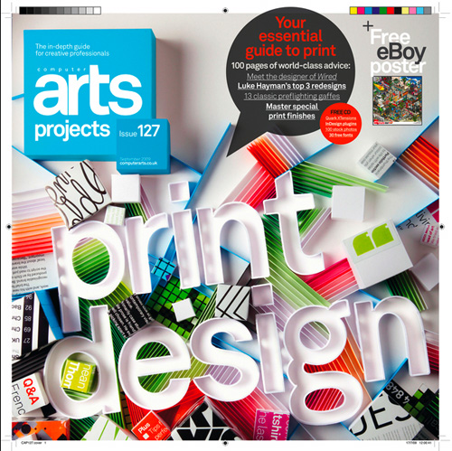
Your magazine will be placed in a stand probably six to eight feet away from the readers and that means, you need to do something crazy to seize the attention away of that long distance. Have a good, sorry great central image and use loads of contrasts to make the visitors stare at your magazine. Magazine cover should be like a beauty pageant that people like to have a look at whenever they got the opportunity.
Tell the Story:
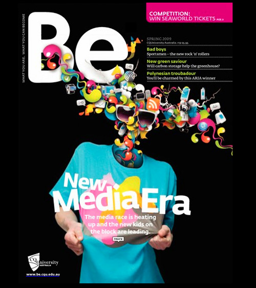
Every magazine has a story to tell and that means, your magazine cover should feature the lead story with due prominence. People would love to have an idea of what the magazine suppose to contain and that means, the main story should get all the attention. This will heighten the interest of the people, however do not blame me for reversal of fortune if the main cover story lacks the creative punches.
Use great colors and fonts:
A common mistake while designing the cover of your magazine is that you take the entire job as another photoshop job. But designing a cover for a magazine is entirely different. Make sure whatever the colors or effects you are using retain their exact form when they get printed. Try fonts that look great when printed and you are free to use some effects like bevel, grow, inner or outer shadow to highlight texts. Rule of thumb is that you need to place the magazine at an 8 feet distance and look at it carefully. Does it look awesome? If yes, you are free to go ahead and maintain the style and all that.
Be Benevolent:
Since every one around is offering freebies to customers in one form or the others, you need to make sure that your are offering something extra and exciting with your magazine. This can be some kind of discount coupons or a free ebook containing some mind-blowing tips that people would definitely not like to miss. However, the most important thing is that how you are supposed to present that within the small encompass of the magazine. You can try a nice and small font with bright color or the other way round or whatever you like but it should not overlap the focus of the magazine.
Make It Look Exciting:
You magazine may be ordinary with nothing special to add to users experience in a given month but the magazine cover should have a different story to tell. Find out the most exciting part of the magazine and give it the most prominent position and add an awesome image. If you can do it, you can see significant changes in the sales volume for sure.

Be Specific:
Rather than giving some vague details about the magazine in the cover, you can go for some specific information. For example, rather than using this Title – “Smartphone of the year – A round Up”, you can try this title – “Be Smart, Have The Best Smartphone of Year – A Comprehensive Collection”.
Show Some Level Of Energy:
Using an ordinary heading is not going to help you win the love and the admiration of the people. You should come up with a compelling heading that can brief what the edition is all about and at the same time, it should give a pictorial description of the contain without making the entire thing look too wordy.
Highlight the Product:
If your magazine is related to technology, it makes sense to feature some cool pictures related to technologies rather than featuring a beautiful girl in her skimpy outfit. There are many magazines out there who are trying the same techniques but believe me when you are targeting niche audience, this does not work at all. You need to true to the theme of the magazine and come up with a great and related image that people would love and appreciate.